Information is Beautiful
January 26th, 2011

![]()

![]()

It’s fun to see how graphics are evolving.
The title of this post is from one of my favorite blogs Information is Beautiful along with a similar blog information aesthetics.
Above from left to right are
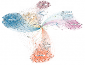
- My Linkedin network
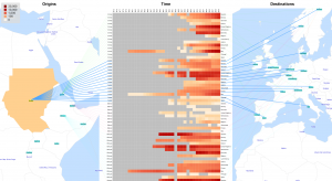
- Population migration
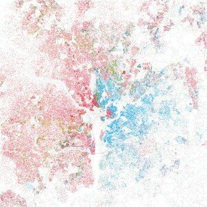
- Race and Ethnicity map of Washington DC
I just like them for the way the display information. I’m more interested in systems performance data but I like these visualizations
The Linkedin visualization has roots in jflowmap which is used to display the second graphic. The third graphic is from a contact on flickr who I think is doing interesting displays with geodata.

Trackbacks
Comments