Graphing Oracle v$sysstat
One thing I’ve failed to clearly document is that my tool ASHMON not only graphs ASH data but graphs v$sysstat as well.
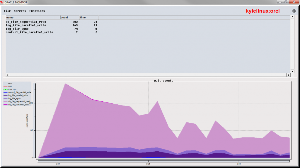
To access statistics in ASHMON click on the “functions” menu and choose “stats”. ( the other choices are “ash init” which goes the the ASH data graph and the third choice is “waits” which graphs data from v$session_event)
Graphing v$sysstat can be overwhelming as the number of statistics is in the hundreds, so what does one look at? The important statistics are what I concentrate on now, but that list is another discussion and up for debate. On the other hand when one wants to explore the stats over time how can one do it in a way that is manageable?
For manageability in ASHMON, I grouped the stats into 20 groups. Having 20 groups is still too much to display, so none are shown by default. By default one has to click on the group button to see it. One can click on as many groups as they way. The first click shows the group and the second click hides.
Inside a group it can be hard to see which line is which statistics, so by passing the mouse over the stat, the line is highlighted.
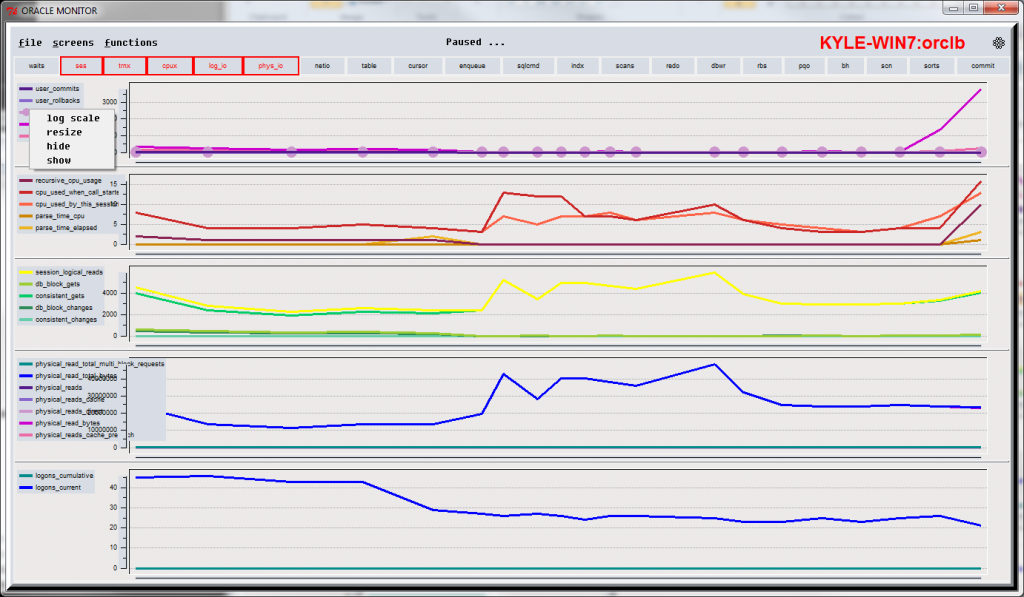
Also a statistics can have high values which hide the the activity in stats with lower values. To address this there are three options. To access these options right click on the statistic and get a popup menu and either chose
- hide
- log scale
- resize
I typically use “hide” and get rid of any values that are too big or not of interest. Once they are gone, a right click in the legend brings back up the menu and I can pick
- show
which will redisplay any hidden stats.
Another option is “log scale” which will make it easier to see movement across different orders of magnitude. A final option is “resize”. Resize will offer the option of changing the Y axis scale, but I rarely do this as the graph autosizes to the maximum point.
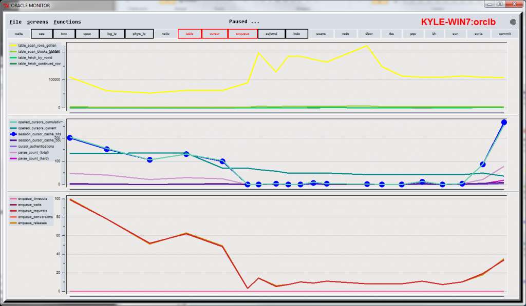
Stats with “table”, “cursor” and “enqueue” selected (the groups selected are highlighted in red at the top)
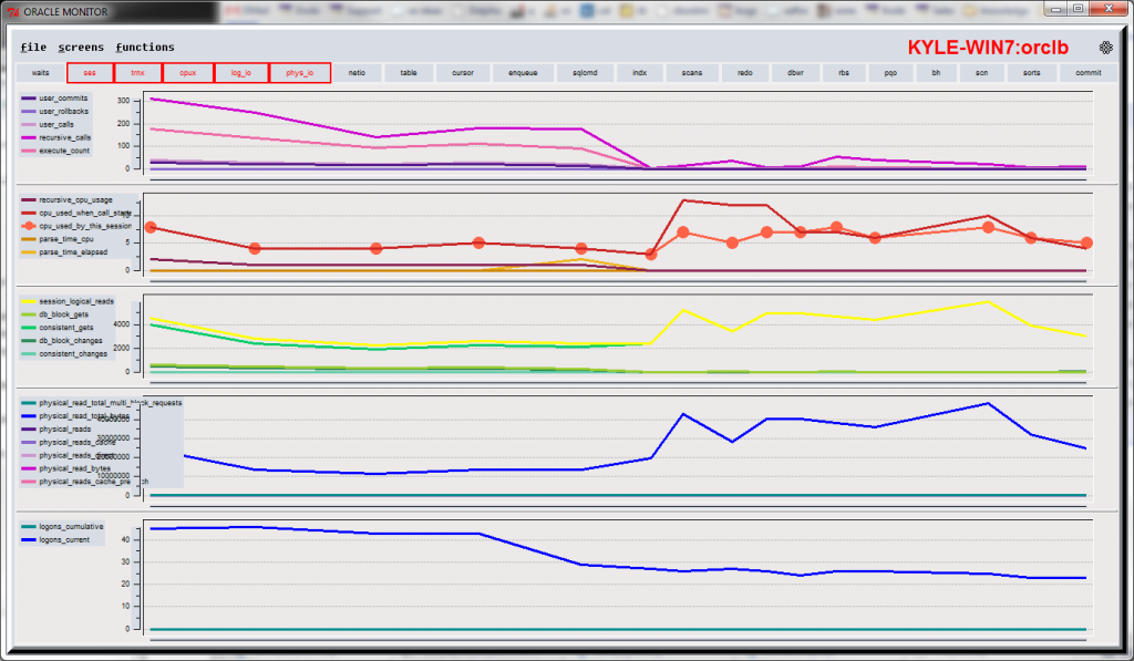
A different set of stats selected, in this case session (ses), transaction (trnx), CPU, log file I/O (log_io) and physical I/O (phys_io).
The right click menu shown with log scale, resize, hide and show.
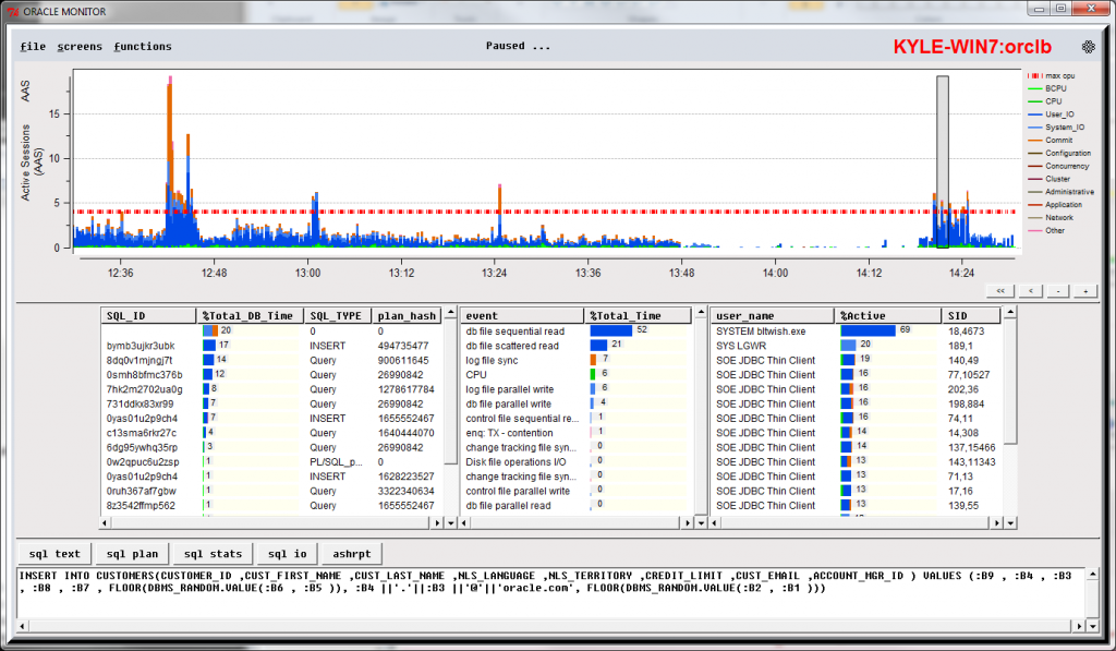
and the ASH screen
The “wait” screen which I never use these days. This is the way I use to show load on the database 10 years ago before ASH data. This screen could be really nice, if I changed the centi_secs per sec, to average wait time per event – maybe I’ll do that soon!f


Trackbacks
Comments
Hi Kyle,
This is Fahd Mirza. I stumbled upon your blog and noticed that you are not using permalinks for your blog post. If you would use them, which is very easy to do in wordpress, your post would be more search engine friendly, and e.g. your this post http://dboptimizer.com/?p=764 would become something like http://dboptimizer.com/graphing-oracle-systat . People searching for graphic oracle would be certain to find this useful post.
Just a suggestion and I am sorry if you already knew it and didn’t set that intentionally.
That’s good information. Just changed the permalink in WordPress – thanks
Nice