OEM 12c , cloud control
October 14th, 2011
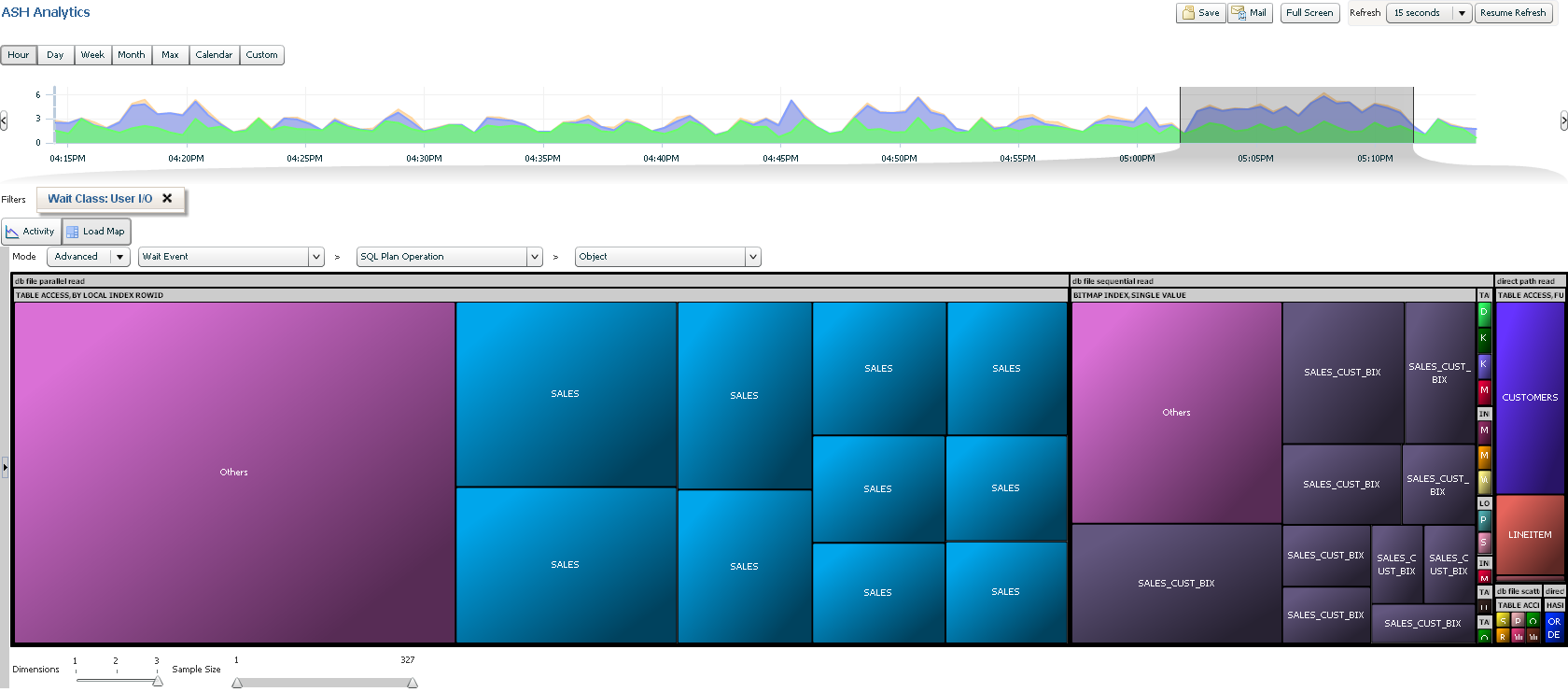
Was emailing with my esteemed college John Beresniewicz at Oracle in the OEM group. John and I worked together on OEM 10g and thank goodness he is still there as he is generally behind any good quantitative visualizations you might see in the product. Here is one cool example he sent me:
The database load, AAS, can be time selected and from the selection a load map is shown, in this case of which objects are creating the most I/O load, group by type of I/O. Super cool. Congrats JB and I look forward to exploring more in OEM 12c “cloud control”.


Trackbacks
Comments
Hi Kyle –
This screenshot is basically the “punch line” from a demo I did at Oracle Openworld this year of the “ASH Analytics” feature that was introduced in EM 12c.
ASH Analytics starts with a view of the “Activity” tab that looks almost identical to the existing “Top Activity” page from EM 10, but with some major improvements. First improvement is the more flexible time picker chart at top of the page, it can be re-sized to any width kind of like the time pickers in Google Finance charts. Below the time picker is the detail region which includes an activity chart and two “top-lists” that default to top sessions and top SQL as in Top Activity. The activity chart defaults to a view of Average Active Sessions broken down by wait class as in Top Activity, but this can be modified break down the load by any of the numerous ASH dimensions that ASH Analytics exposes for analysis.
The dimension selection drop-downs expose a structured list of ASH dimensions but also a small graphical widget showing load breakdown summary for some of the most commonly useful dimensions. This is to enable efficient interactive exploration by exposing dimensions that have high level of skew (interesting) or ones without any breakdown (uninteresting, like instance_id in a single instance database.)
In the activity chart clicking on a band will apply a filter to select out only the load corresponding to that specific value of the dimension shown. So for instance in the view shown here the load was filtered to only show “User IO” wait class activity. The filtered activity is then presented in the activity chart along with a dark line to show the total activity, so user is kept aware of how much of the total load is being analyzed. The dimensional breakdown/filtering cycle can be repeated to further zero in on load of interest, so for instance we could have broken down the “User IO” activity by wait event and then filtered out only “db file sequential read”.
Now for the punch line, which is the “Loadmap” view that you’ve posted here. The loadmap is a treemap visualization of database load over a dimensional hierarchy of up to three dimensions selected by the user. Cell size is always Average Active Sessions (of course) and colors are selected based on the final cell dimension value (so all the “SALES” cells are same color) There is algorithmic color selection for most dimensions, but if wait class is the final dimension then we use the existing coloring scheme developed for the Performance Page and Top Activity to keep that scheme “branded”. Reading treemaps can take a bit of practice, but it’s really quite simple: hierarchical relationships are represented by rectangle containment, i.e. the load for a child dimension will appear as a rectangle within the rectangle representing the parent dimension.
So in the demo I selected a time period of interest because of unusually high IO using the time picker. In the Activity view broken down by wait class I isolated the User IO load by applying a filter. Switching to the Loadmap I broke down the User IO waits hierarchically by wait event > SQL plan operation > object. And the punch line is that we can eyeball that over half the load in that time period was “db file parallel read” all generated on behalf of “TABLE ACCESS BY LOCAL INDEX ROWID” execution plan steps almost all of which were done against the “SALES” table (which is partitioned and thus appears as multiple cells, one for each partition.)
So ASH Analytics is a pretty powerful tool for interactive visual exploration of ASH data. I sure hope customers like it because ASH treemaps is an idea I researched and became convinced of in early 2007 so as you can see it took a long time to finally get it into the product.
JB
for more info see Niall’s blog at
http://orawin.info/blog/2011/10/10/first-impressions-of-em12c/
Install guides at
http://sve.to/2011/10/07/installing-oracle-enterprise-manager-cloud-control-12-on-oel-6-1/and
https://supporthtml.oracle.com/ep/faces/secure/km/DocumentDisplay.jspx?id=1360183.1and
http://martincarstenbach.wordpress.com/2011/10/07/installing-oracle-enterprise-manager-12c-on-ol-5-7/
download at
http://www.oracle.com/technetwork/oem/grid-control/downloads/index.html