ASH Visualizations: R, ggplot2, Gephi, Jit, HighCharts, Excel ,SVG
There is more and more happening in the world of visualization and visualizing Oracle performance specifically with v$active_session_history.
Of these visualizations, the one pushing the envelope the most is Marcin Przepiorowski. Marcin is responsible for writing S-ASH , ie Simulated ASH versions 2.1,2.2 and 2.3. See
- http://oracleprof.blogspot.com/2011/11/new-release-of-s-ash-v23.html
- https://github.com/pioro/orasash
Here are some examples of what I have seen happening out there in the web with these visualizations grouped by the visualization tool.
Gephi
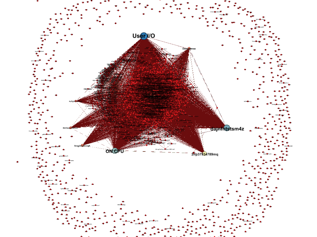
The first example is using Gephi. The coolest example of Gephi I’ve seen is Greg Rahn’s analysis of the voting for Oracle World mix sessions. 
Here is Marcin’s example using Gephi with ASH data:
JIT
Here are two more examples from Marcin Przepiorowski using JIT or Javascript InfoVis Toolkit
Click on the examples to go to the actual HTML and not just the image. On the actual page from Marcin you can double click on nodes to make them the center of the network.
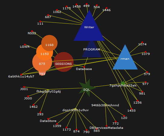
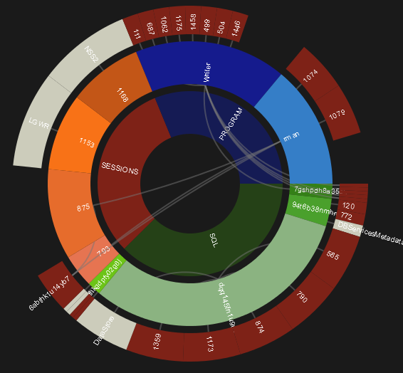
TOP 5 SQL_ID, SESSIONS and PROGRAMS joined together with additional joins to points not included in top 5. ex. TOP 5 SQL ID with list of sessions and programs TOP 5 SESSIONS with list of sql_id’s and programs TOP 5 PROGAMS with list of sessions and sql id’s
R
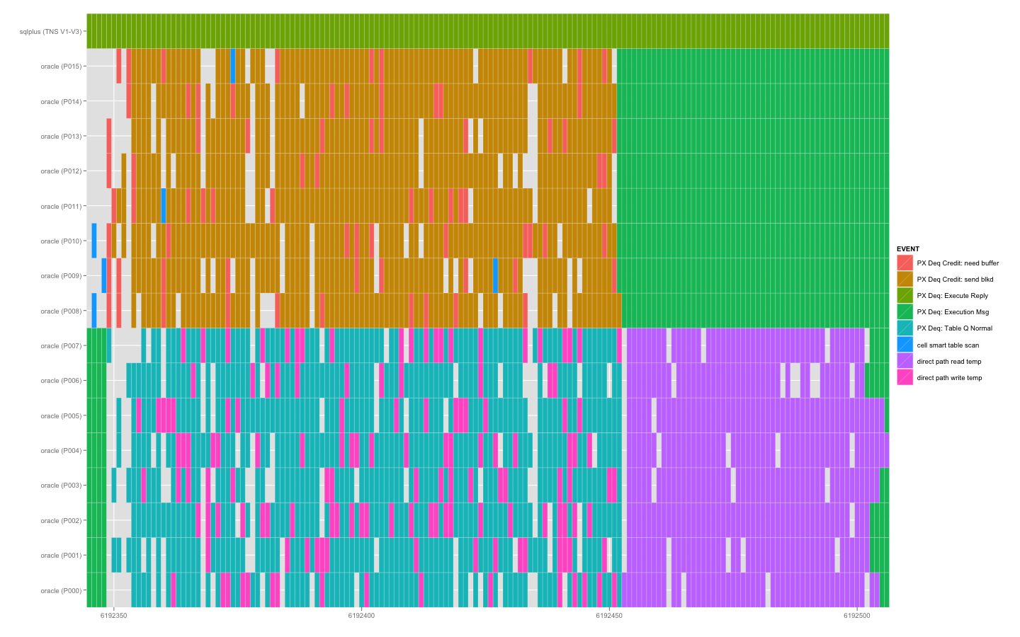
Frits Hoogland gives a great blog entry on getting started with R and then using R to analyze 10046 tracefiles (sort of ASH on steroids)
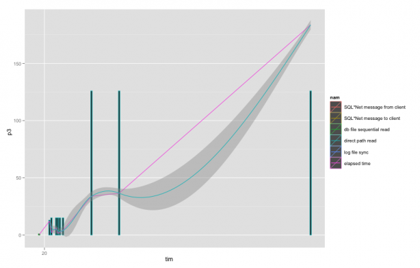
Here from Greg Rahn again is one of the cooler examples of R. In this case it’s the ASH data of a parallel query execution showing the activity of the different processes:
HighCharts
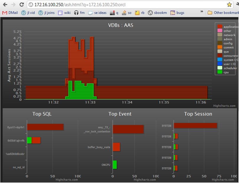
Here is an example basically reproducing the Top Activity screen with highcharts, a sqlscript on v$session and a cgi script to feed the data to the web page:
SVG
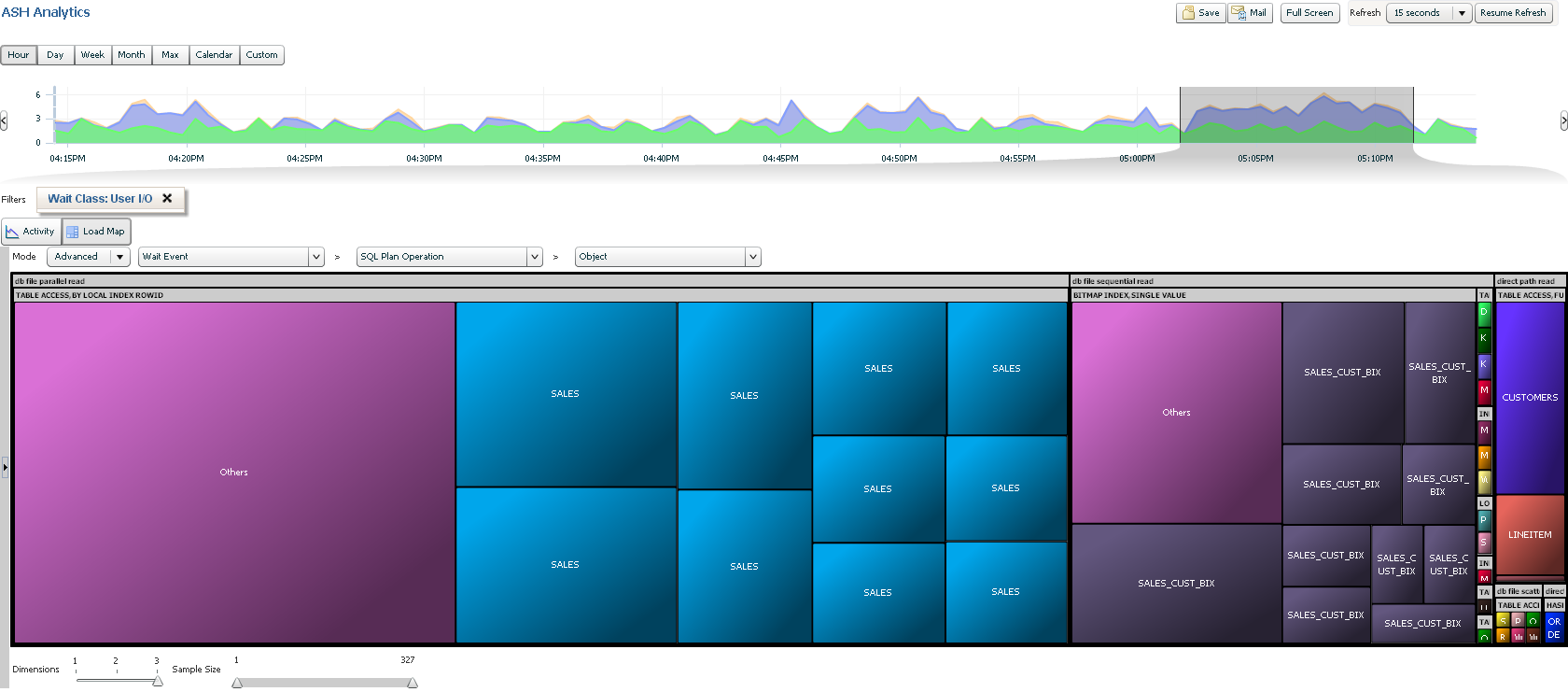
OEM 12c shows the new face of Enterprise Manager with the load maps
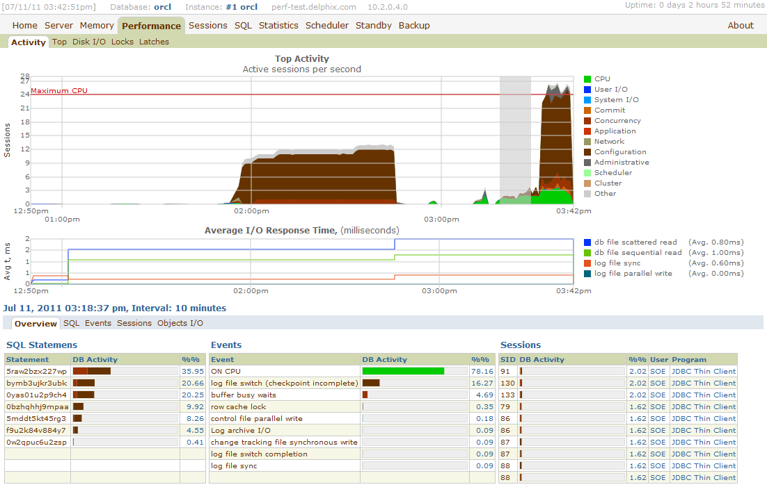
PL/SQL and SVG : EMlite
(quick apex example: http://ba6.us/node/132)
Excel
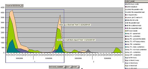
Karl Arao has been doing a good bit of ASH visualization using his own Excel work as well as Tanel’s Excel Perf Sheet ( see a video here)
http://karlarao.wordpress.com/2009/06/07/diagnosing-and-resolving-gc-block-lost/


Trackbacks
Comments
Thanks for keeping the visualizations flowing. I didn’t realize until I visited again that there is a link to one of my blog posts here so I am flattered.
Loving the new tools available for visualization as of late. There are a lot of choices in the JavaScript space that I am looking into now. JIT, HighCharts, D3, just got my invite for the beta of PolyChart.js today…
The easy part is usually gathering the data. The issue I always seem to have is second guessing some of the fancy visualizations and their applicability to the data. I love the JIT sunburst (the circular one above) but I think I need a fewa clues to know what I’m looking at. Maybe can be cured with a legend or might be easier to digest with some context, but clarity is my #1 priority. I want to show graphs I generate to other DBAs and managers and have them ‘get it’.
I won’t even get into the new dynamic features of these libraries, I have to make sure they convey info well as static charts before I make that leap :)