Archive

Posts Tagged ‘vst’

Woohoo: VST takes the next step

July 8th, 2011


for more info see

The new release of  DB Optimizer , version 3.o, from Embarcadero has awesome new feature : explain plan overlay onto VST diagrams!

Let’s take an example query:

SELECT COUNT (*)
FROM   a,
       b,
       c
WHERE
       b.val2 = 100 AND
       a.val1 = b.id AND
       b.val1 = c.id;

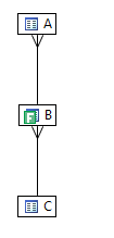
There are  indexes on b.id and c.id.  Diagramming the query in DB Optimizer gives

The red lines with crows feet mean that as far as the definitions go, the relations could be many to many.

Question is “what is the optimal execution path for this query?”

One of  the best execution plans is to

  1. start at the most selective filter table
  2. join to children  if possible
  3. else join to parent

There is one filter in the diagram, represented by the green F on table B. Table B has a filter criteria in the query “b.val2=100″.

Ok, table B is where we start the query. Now where do we go from B? Who is the parent and who is the child? It’s not defined in the constraints nor indexes on these tables so it’s hard for us to know. Guess what ? It’s also hard for Oracle to figure it out. Well, what does Oracle decide to do? This is where the cool part of DB Optimizer 3.o comes in.

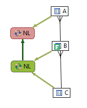
The super cool thing with DB Optimizer 3.0 is we can overlay the diagram with the actual execution path (I think this is so awesome)

For the digram we can see Oracle starts with B and joins to A. The result if this is joined to C. Is this the optimal path?

Well, let’s keep the same indexes and just add some constraints:

alter table c add constraint c_pk_con unique (id);
alter table b add constraint b_pk_con unique (id);

Now let’s diagram the query with DB Optimizer:

We can now see who the parent and child is, so we can determine the optimal query path which is to start at B, the only filter and  join to the child C then to the parent A.  Now what does Oracle do with the added constraint info:

Guess what? The execution plan has now changed with the addition of constraints and now Oracle’s execution path goes from a suboptimal plan to  the optimal path. Moral of the story is to make sure and define constraint information because it helps the optimizer, but what I wanted to show here was the explain plan overlay on the diagram which makes comparing execution plans much easier. Putting the queries VST diagrams side by side along with the overlay of execution path we can clearly and quickly see the differences:

I plan to blog more about this awesome feature. It’s really cool.

Here is an example from an article by Jonathan Lewis

http://www.simple-talk.com/sql/performance/designing-efficient-sql-a-visual-approach/

The query Jonathan discusses is

SELECT order_line_data
FROM
         customers cus
         INNER JOIN
         orders ord
         ON ord.id_customer = cus.id
         INNER JOIN
         order_lines orl
         ON orl.id_order = ord.id
         INNER JOIN
         products prd1
         ON prd1.id = orl.id_product
         INNER JOIN
         suppliers sup1
         ON sup1.id = prd1.id_supplier
   WHERE
         cus.location = 'LONDON' AND
         ord.date_placed BETWEEN '04-JUN-10' AND '11-JUN-10' AND
         sup1.location = 'LEEDS' AND
    EXISTS (SELECT NULL
            FROM
                 alternatives alt
                 INNER JOIN
                 products prd2
                 ON prd2.id = alt.id_product_sub
                 INNER JOIN
                 suppliers sup2
                 ON sup2.id = prd2.id_supplier
           WHERE
                  alt.id_product = prd1.id AND
                  sup2.location != 'LEEDS')

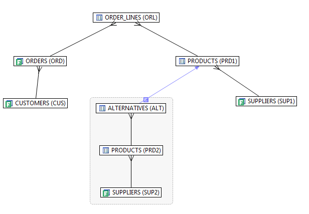
which diagrammed looks like

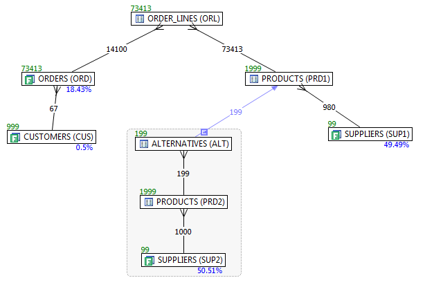
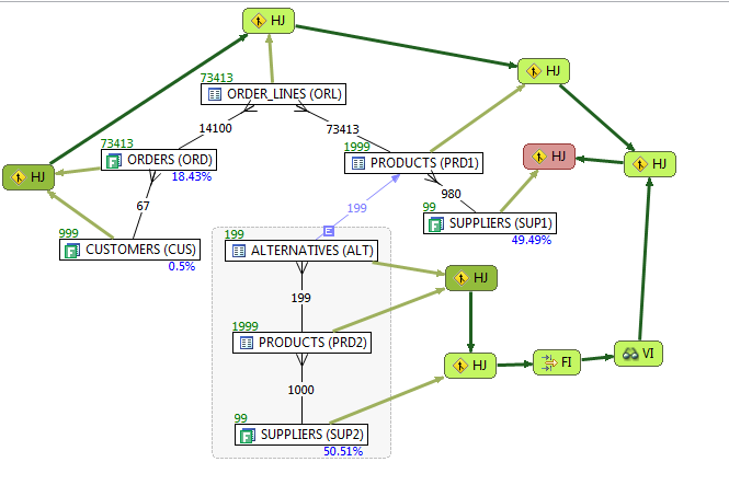
There are multiple filters, so we need to know which one is the most selective to know where to start, so we ask DB Optimizer to display the statistics as well  (blue below a table is the filter %, green above is # of rows in table and numbers on join lines are rows returned by a join of just those two tables)

Now that we can determine a candidate for best optimization path, does Oracle take it?

Can you find the optimization error?

Dark green is where execution starts. There are two starts: one for the main query body and one for the subquery.

The red is where query execution ends.

( also see this older blog on the designing VST http://dboptimizer.com/2010/08/03/product-design-vst/ )

PS a big part of this work is by the lead developer Matt Vegh. Many thanks to Matt for this awesome work.


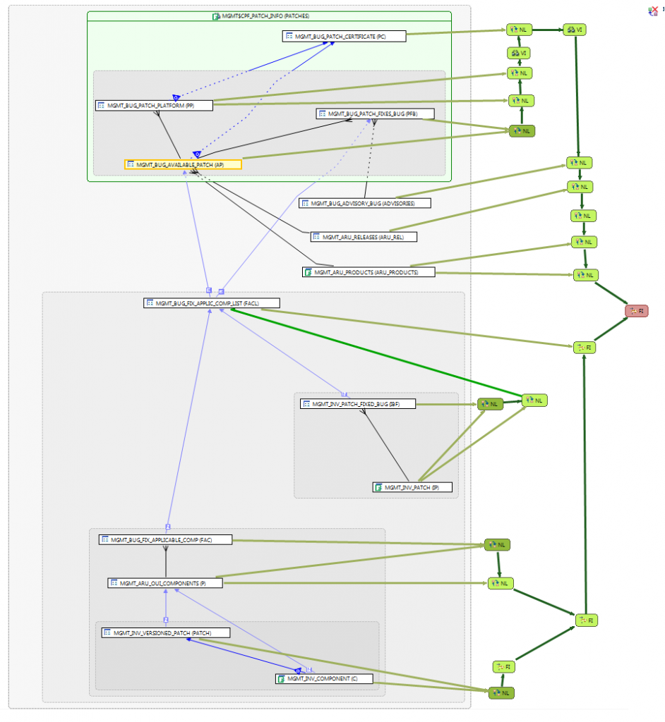
PPS another example from Karl Arao

The dark green nodes are starts, so there are 4 separate starts. We can see how the result sets from each start are joined with each successive table join set. The red is the final step.

Uncategorized

SQL Tuning Best Practice – Visualizing the Query

September 10th, 2010


SQL tuning can be a challenge to even the most experienced database professional. So, how can you give yourself a leg up in optimizing a difficult query? As you will discover in this best practice, visualizing the query can help you quickly understand the query, as well as define its optimal execution path.

A best practice for visualizing the query is to draw the query out as a Visual SQL Tuning (VST) diagram.

A VST diagram consists of the following elements:

  • tables as nodes
  • joins as connectors
  • filter percentages
  • relationships
  • join sizes

Historically, SQL tuning has been limited to the following two approaches:

  1. Explain plan for the query; and/or
  2. Trace the query

For example, a trace output might look something like this:e

PARSING IN CURSOR #2 len=53 dep=0 uid=61 oct=3 lid=61 tim=1151519905950403 hv=2296704914 ad='4e50010c'
SELECT 'Hello, world; today is ' || SYSDATE FROM dual
END OF STMT
PARSE #2:c=4000,e=1540,p=0,cr=0,cu=0,mis=1,r=0,dep=0,og=1,tim=1151519905950397
BINDS #2:
EXEC #2:c=0,e=58,p=0,cr=0,cu=0,mis=0,r=0,dep=0,og=1,tim=1151519906034782
WAIT #2:
nam='SQL*Net message to client' ela= 2 driver id=1650815232 #bytes=1 p3=0 obj#=-1 tim=1151519906034809
FETCH #2:c=0,e=29,p=0,cr=0,cu=0,mis=0,r=1,dep=0,og=1,tim=1151519906034864
WAIT #2:
nam='SQL*Net message from client' ela= 215 driver id=1650815232 #bytes=1 p3=0 obj#=-1 tim=1151519906035133
FETCH #2:c=0,e=1,p=0,cr=0,cu=0,mis=0,r=0,dep=0,og=0,tim=1151519906035165
WAIT #2:
nam='SQL*Net message to client' ela= 1 driver id=1650815232 #bytes=1 p3=0 obj#=-1 tim=1151519906035188
WAIT #2:
nam='SQL*Net message from client' ela= 192 driver id=1650815232 #bytes=1 p3=0 obj#=-1 tim=1151519906035400
STAT #2 id=1
cnt=1 pid=0 pos=1 obj=0 op='FAST DUAL (cr=0 pr=0 pw=0 time=3 us)

Not exactly user-friendly. I think I might need a couple of double espressos before I plunge into this one.

How about an explain plan? An explain plan is better, but still lacking insightful information

--------------------------------------------------------------------------------------------

| Id | Operation | Name | Starts | E-Rows | A-Rows |

---------------------------------------------------------------------------------------------

| 1 | HASH GROUP BY | | 1 | 1 | 1 |

|* 2 | FILTER | | 1 | | 1909 |

|* 3 | TABLE ACCESS BY INDEX ROWID | PS_RETROPAYPGM_TBL | 1 | 1 | 3413 |

| 4 | NESTED LOOPS | | 1 | 165 | 6827 |

|* 5 | HASH JOIN | | 1 | 165 | 3413 |

|* 6 | HASH JOIN | | 1 | 165 | 3624 |

| 7 | TABLE ACCESS BY INDEX ROWID | WB_JOB | 1 | 242 | 2895 |

| 8 | NESTED LOOPS | | 1 | 233 | 2897 |

| 9 | TABLE ACCESS BY INDEX ROWID| PS_PAY_CALENDAR | 1 | 1 | 1 |

|* 10 | INDEX RANGE SCAN | PS0PAY_CALENDAR | 1 | 1 | 1 |

|* 11 | INDEX RANGE SCAN | WBBJOB_B | 1 | 286 | 2895 |

|* 12 | TABLE ACCESS FULL | WB_RETROPAY_EARNS | 1 | 27456 | 122K|

| 13 | TABLE ACCESS FULL | PS_RETROPAY_RQST | 1 | 13679 | 13679 |

|* 14 | INDEX RANGE SCAN | PS#RETROPAYPGM_TBL | 3413 | 1 | 3413 |

| 15 | SORT AGGREGATE | | 1791 | 1 | 1791 |

| 16 | FIRST ROW | | 1791 | 1 | 1579 |

|* 17 | INDEX RANGE SCAN (MIN/MAX) | WB_JOB_F | 1791 | 1 | 1579 |

| 18 | SORT AGGREGATE | | 1539 | 1 | 1539 |

| 19 | FIRST ROW | | 1539 | 1 | 1539 |

|* 20 | INDEX RANGE SCAN (MIN/MAX) | WB_JOB_G | 1539 | 1 | 1539 |

---------------------------------------------------------------------------------------------

Predicate Information (identified by operation id):

---------------------------------------------------

2 - filter(("B"."EFFDT"= AND "B"."EFFSEQ"=))

3 – filter(“E”.”OFF_CYCLE”=”A”.”PAY_OFF_CYCLE_CAL”)

5 – access(“D”.”RETROPAY_SEQ_NO”=”C”.”RETROPAY_SEQ_NO”)

6 – access(“C”.”EMPLID”=”B”.”EMPLID” AND “C”.”EMPL_RCD#”=”B”.”EMPL_RCD#”)

10 – access(“A”.”RUN_ID”=’PD2′ AND “A”.”PAY_CONFIRM_RUN”=’N')

11 – access(“B”.”COMPANY”=”A”.”COMPANY” AND “B”.”PAYGROUP”=”A”.”PAYGROUP”)

12 – filter((“C”.”RETROPAY_PRCS_FLAG”=’C’ AND “C”.”RETROPAY_LOAD_SW”=’Y'))

14 – access(“E”.”RETROPAY_PGM_ID”=”D”.”RETROPAY_PGM_ID”)

17 – access(“F”.”EMPLID”=:B1 AND “F”.”EMPL_RCD#”=:B2 AND “F”.”EFFDT”<=:B3)

20 – access(“G”.”EMPLID”=:B1 AND “G”.”EMPL_RCD#”=:B2 AND “G”.”EFFDT”=:B3)

If I was greeted with this first thing in the morning, I’d definitely get a coffee before attempting to operate on it.

The explain plan is just a set of directions that the database takes to retrieve the data from the database in order to satisfy an SQL query. An analogy would be if we imagine the SQL query as a google maps request for directions to get from my home in the suburbs to my office downtown. The explain plan is like the turn-by-turn route list. But for any of us who have gotten lost well know, it’s also nice to be able to see the map as well as the turn-by-turn directions.

If google maps only gave me the directions without the map I’d be pretty upset, probably lost and totally anxious about how long it’s going to take me to get to my destination.

Are these a good set of directions? (from where I live to where I work, in San Francisco):

It might help if I had a map:

On the map, the directions look pretty sensible, but what if there was a traffic jam on some streets and not others? How about a map that included traffic jams (i.e. bottlenecks)?

Whether the turn-by-turn directions are good or bad requires a map (i.e. visual information). So how do we get a map of for an SQL query? Let’s start with the terrain. We can describe the terrain by laying out the tables in the query graphically and drawing connectors for every join, or routes through the diagram. A diagram could look like this:

Now we have a map of the terrain. Seeing the terrain allows us to pick out an optimal explain plan. To pick an optimal explain plan, find tables that have the most selective filter and start the execution there. In the above case there is only one table with a filter. This filter is denoted by the F icon on the table BROKER. Start at BROKER and then look for joins that keep the running row set size to a minimum. The running row set size is the number of rows we carry from the previous node to the next node in the VST. We have to visit all the nodes, but the fewer rows we have to carry with us from one node to the next, the faster we’re going to arrive at our destination.

Whether you draw out the VST by hand or use a tool, a best practice is to draw the child table above the parent table. This layout encourages us to navigate the VST join down to keep our running row set the same size vs. joining up which will generally increase the row set size:

Thus, the idea is to start at the most selective filter and join down before joining up. In our example there is only one filter on BROKER, so we start there, we join down to OFFICE_LOCATION, then finish off with CLIENT_TRANSACTION, and end at CLIENT.

But what if we have more than one filter and we have to choose? In that case we have to calculate the filter percentage. The filter percentage is simply the number of filter rows divided by total rows in the table. Filter rows are the number of rows returned after applying the filter criteria on that table from the query.

In the diagram below, BROKER is the most selective filter at .05% so we start at BROKER and follow the same path as we just discussed:

But what if we don’t have access to any information identifying the parent-child relationships (such as PK/FK constraints, unique indexes or unique constraints)? In those cases, we may be looking at many-to-many relationships. With many-to-many relationships, it’s unclear how to navigate the VST. We no longer know whether to join up or down. To solve this impasse, we can add the two table join row sizes to help us navigate. Below, we’ve drawn the two table join sizes on the join lines:
To navigate the VST above, we again start at BROKER with the most selective filter, then look for the smallest two table join size which is OFFICE_LOCATION with a join size of 3. Then we join to CLIENT_TRANSACTION and finally CLIENT.

As you can see, VST diagrams act like the map for the terrain that an SQL query has to navigate. When a simple map is not enough, we can add statistics such as filter percentages and two table join sizes to complete the map. VST diagrams can be drawn on paper, with tools such as Visio or with database products that draw them automatically using the SQL query, schema definitions and table statistics.

For more perspective on the visual approach to tuning SQL and drawing VST diagrams see
SQL Tuning by Dan Tow
Refactoring SQL Applications by Stephan Faroult , chapter 5
“Designing Efficient SQL: A Visual Approach” by Jonathan Lewis
http://www.simple-talk.com/sql/performance/designing-efficient-sql-a-visual-approach/

Uncategorized